Brand Story
PURE ENERGY acronym stands for Power Using Renewable Energy and true to its name ever since its genesis at IIT Hyderabad, the company has focused on enabling transition to sustainable energy sources. Energy storage technology has been a key area of expertise for the company. The firm has executed hybrid solar storage projects for many prestigious business groups, Universities, Hospitals, Residential Communities, NGOs, and Schools. The company management team brings significant experience from academia and the energy industry.
The company made a foray into manufacturing electric two-wheeler under the brand “PURE EV” and high-performance Lithium batteries under the brand “PURE Lithium”. The company has been funded by a visionary from the Pharma industry Shri V C Nannapaneni. The company has set up a dedicated 40,000 sq ft manufacturing unit and is geared up to become one of the leading EV startups in India in times to come!
The company is focused on building products that are beloved by the mass consumer and building a trustworthy brand name in EV and ESS business verticals.

Brand Design
IDENTITY
Brand logo
Growth and equality are core values of humanity and mankind. Born to bring revolution in the Electric Vehicle world, Pure EV has embedded these values in it’s logo - Growth of curiosity and equality of affordance. With this motto, the logo brings together the power of electricity and he dynamics of motion present to the user not just a product, but an experience. The logo is in itself a catalyst for innovation and futurism.
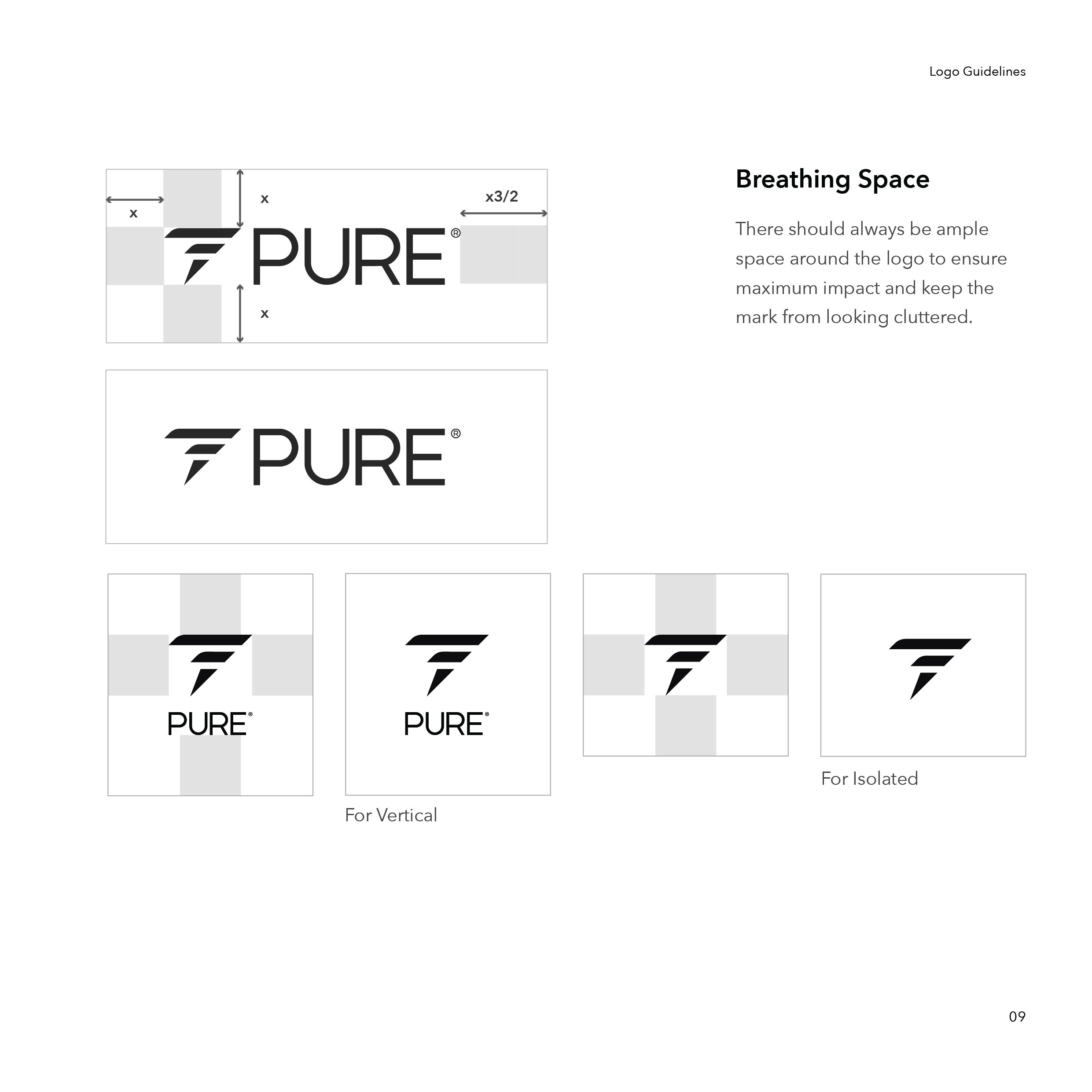
Logo construction and guidelines
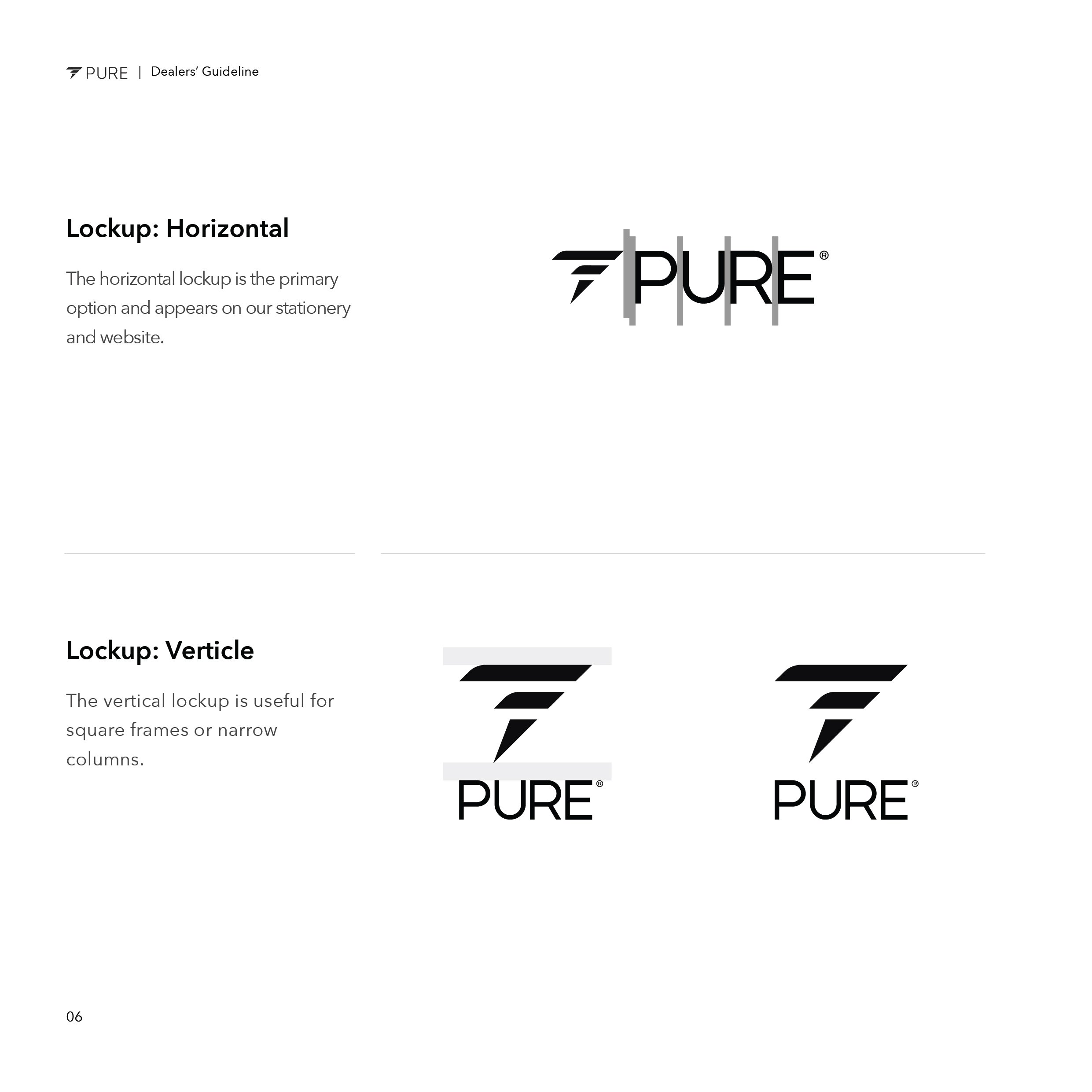
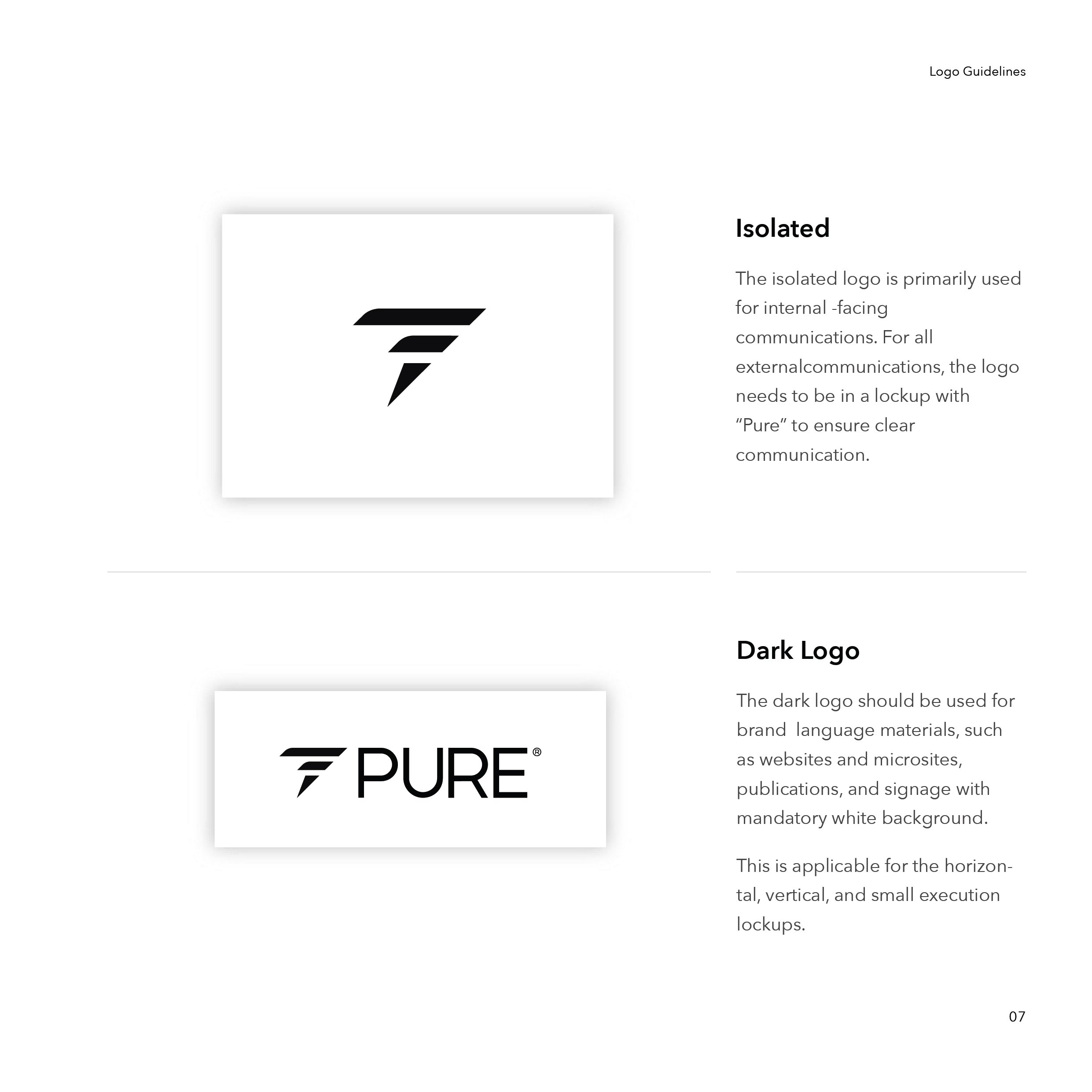
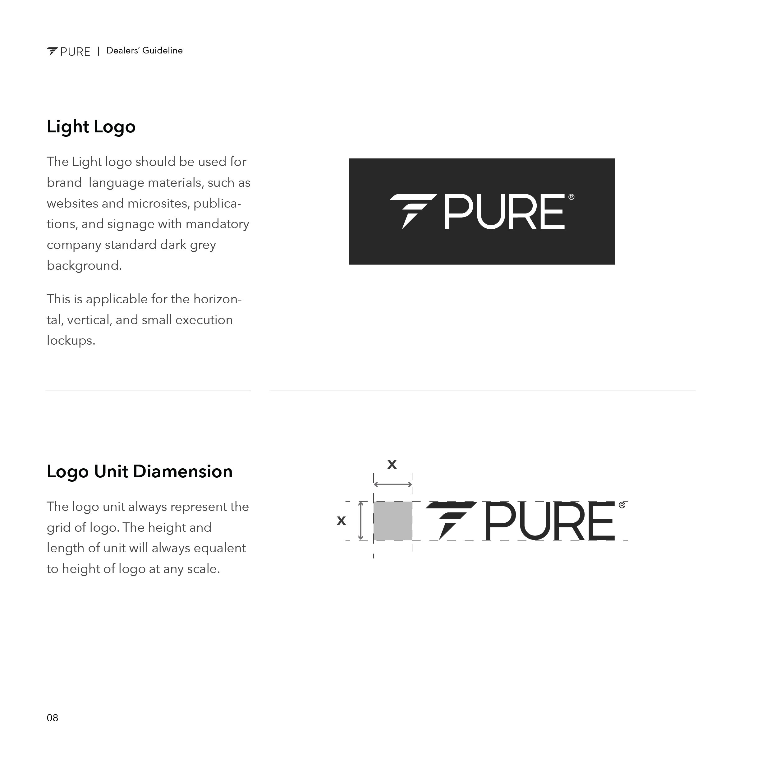
Creating and applying the logo was the most important part of the design strategy, especially when dealing with over 150 dealers nationwide and aiming to keep the brand consistent. This required careful planning, teaching the stakeholders, clear communication, and detailed design guidelines.


SETTING UP THE TONE
Color, Typeface, Images and voice
Going beyond just the visual aspects, shaping the brand's voice, appearance, and feel deepens the impact of your design and enhances brand value. Therefore, we captured the essence of the brand's personality by defining its typography, colors, imagery, and overall style.


Design Execution
THUMB RULE OF PHYSICAL EXPERIENCE
Physical Space Design
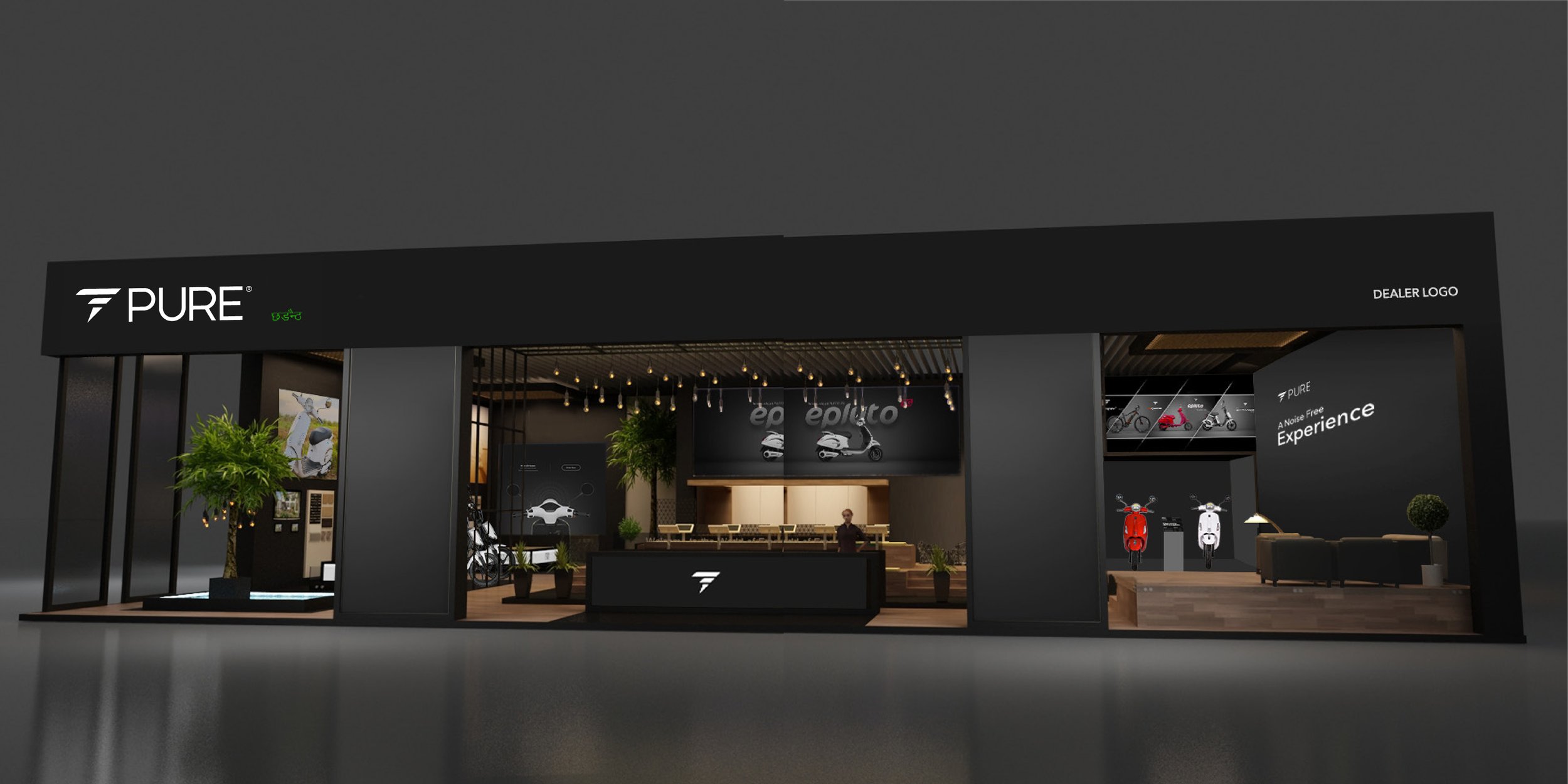
Growing the brand in a physical space demands meticulous strategic planning due to the engagement of various stakeholders. It involves coordinating with a range of vendors nationwide, requiring clear and effective brand communication. To ensure consistency and understanding across all touchpoints, it is essential to provide comprehensive design documentation complete with detailed guidelines. This approach ensures that every vendor can accurately represent the brand, maintaining uniformity and reinforcing the brand's presence in the physical domain.


EXPANDING BRAND VALUE
Outdoor Print design
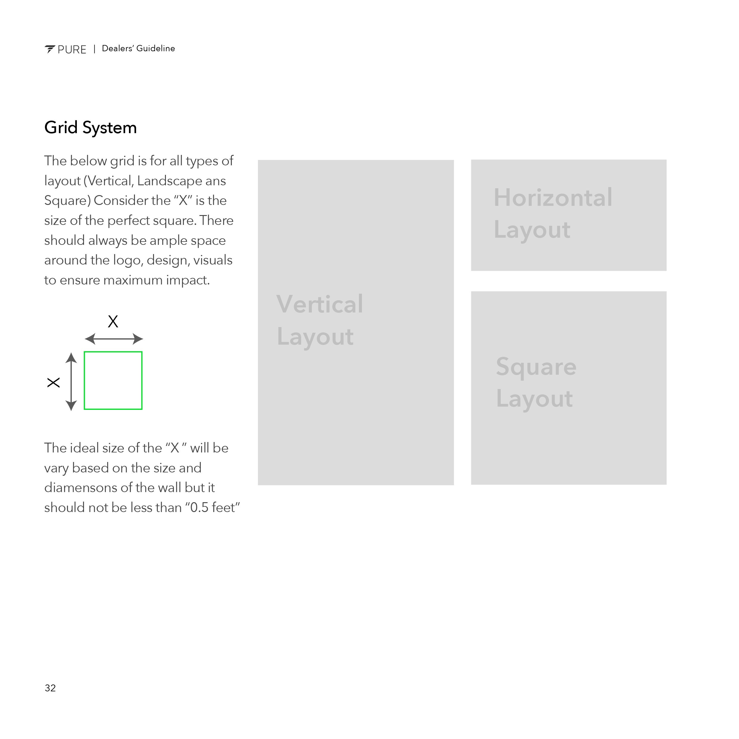
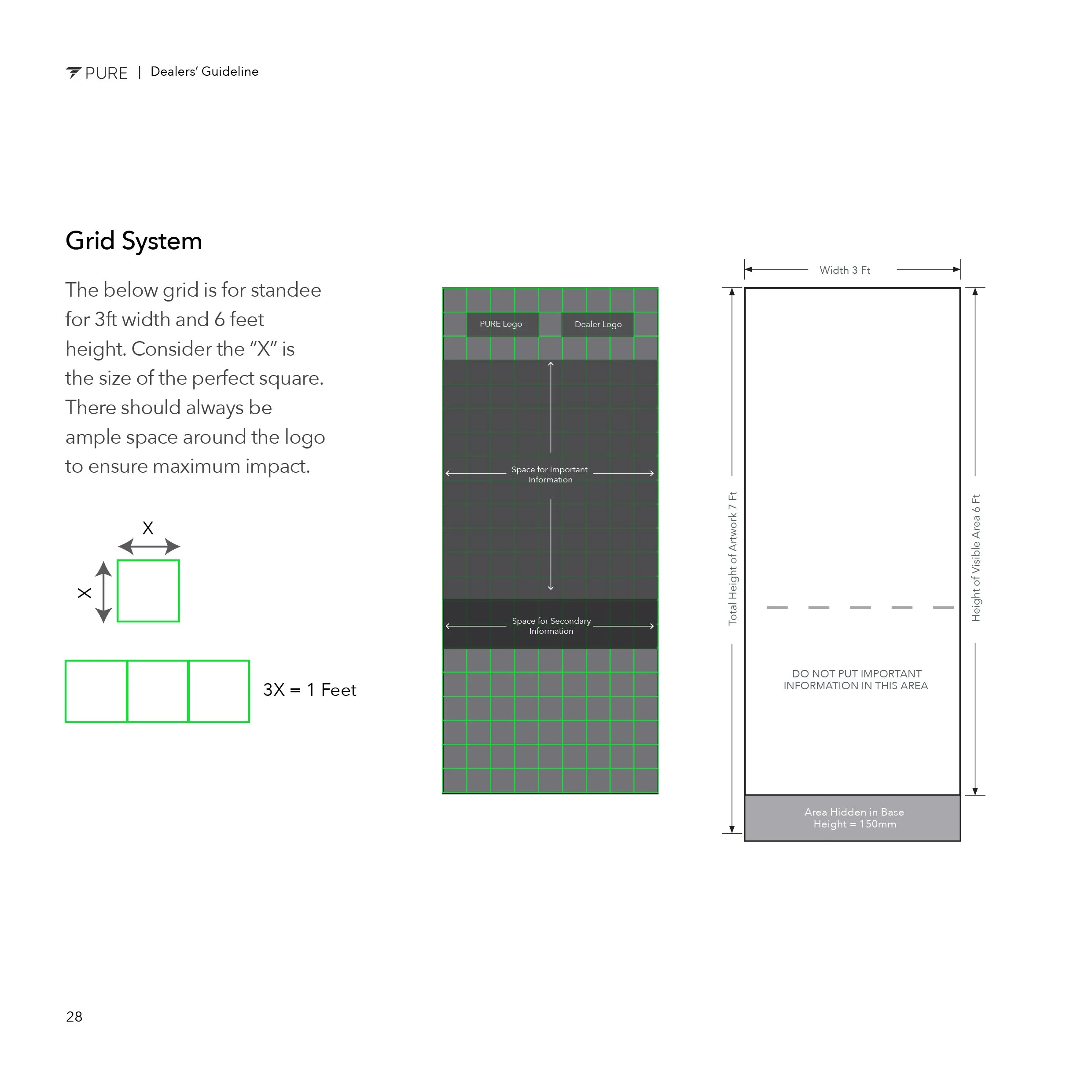
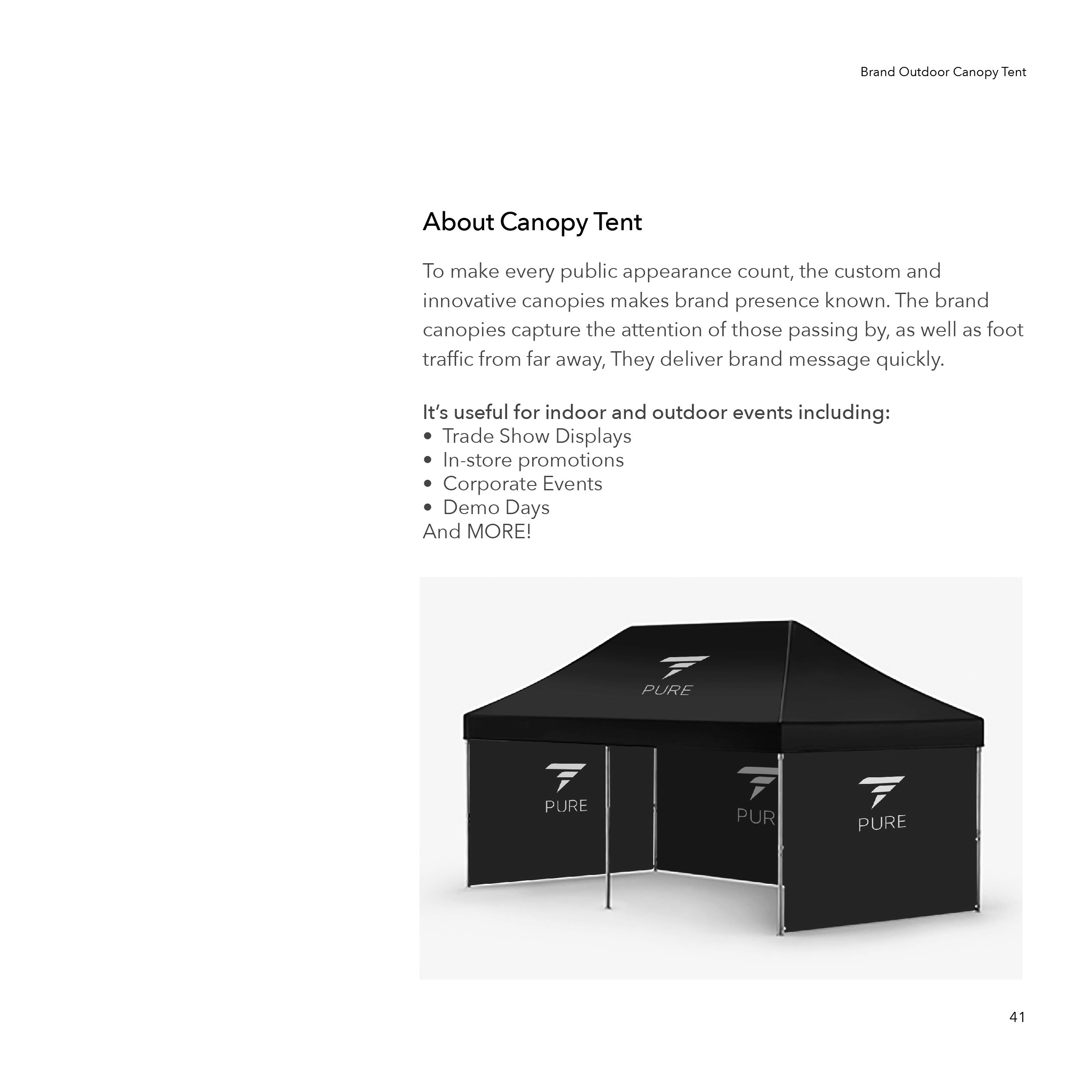
Engaging with customers through small interactions at touchpoints such as outdoor designs can significantly enhance brand value and promote awareness. However, this effectiveness hinges on the meticulous implementation of the design strategy. To ensure precise execution, we developed comprehensive guidelines for outdoor branding. Properly implementing these designs has been instrumental in building trust among the public. Through this strategic approach, every outdoor interaction becomes an opportunity to reinforce the brand's message and establish a deeper connection with the audience.



BUILDING BRAND RELATION
Merchandising
Integrating the brand seamlessly into the customer's daily lifestyle represents a pinnacle of success in design thinking. Utilizing everyday merchandise as a vehicle for brand engagement fosters a deeper relationship with customers, positioning the brand as a trusted and reliable presence in their lives. Through this strategic approach, the brand becomes more than just a product or service; it becomes a familiar and comforting part of the customer's everyday routine, enhancing loyalty and strengthening the brand's market position.


Digital Presence
FIRST WEBSITE LAUNCH
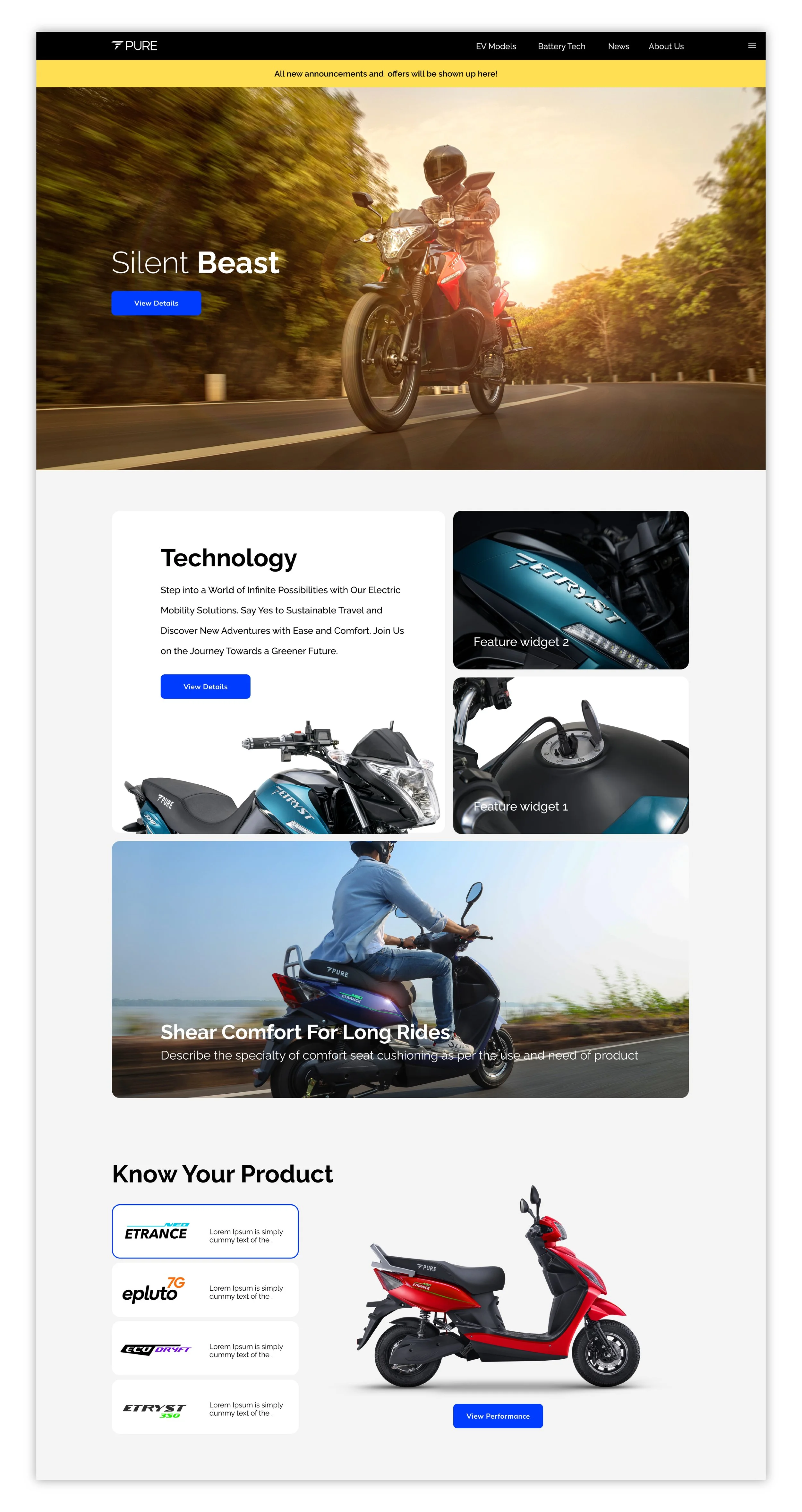
Desktop design phase 1
Our initial website design adopted a minimalist approach, leveraging limited resources and research. The task of designing for consumer segments and dealerships in the emerging field of electric vehicles presented unique challenges, notably due to the nascent size of consumer groups. Furthermore, the business objectives were not sufficiently defined to construct a comprehensive strategy around the brand identity. Consequently, our initial strategy was to maintain a streamlined website design, with the intention of allowing it to evolve in complexity and functionality as the company expanded and the customer base broadened. As the business gains momentum, we anticipate gaining clearer insights into our business goals, which will inform future enhancements and refinements to the website, ensuring it aligns with our evolving brand strategy and market positioning.


INTRODUCED PERSONA FOCUS FLOW
Second phase of design
Nearly a year into operation, the company began to experience significant growth and success in the market. This expansion was mirrored in the growth of our dealer network, which in turn attracted more customers to the brand. This growth provided us with the invaluable opportunity to engage with a broader audience, allowing us to more clearly define and shape our vision. Simultaneously, the electric vehicle (EV) market itself matured, offering a more stable and defined landscape for our strategic planning.
This maturation of the market enhanced our research capabilities, enabling us to devise more targeted strategies for brand positioning. In line with our brand strategy aimed at addressing the diverse needs of all customer segments on a personal level, we introduced a variety of vehicles to cater to different personas. Building on this approach, we began crafting unique web experiences tailored to the specific preferences, goals, and satisfaction levels of each persona. This customization allowed us to connect more deeply with our audience, fostering a stronger, more personal relationship between the brand and its customers.


IDEA BECOME LARGER
Adding visual identity
At this juncture, we began to align our design vision more closely with customer needs and business objectives, marking a significant shift in our design approach. We enriched our designs with a greater number of images and experimented with color tones, emotions, and music to foster a deeper connection between people and the brand. Our guiding philosophy was to build trust and establish a strong bond between the customer and the company, in harmony with our leadership's goals.
To achieve this, we strategically incorporated more imagery into our designs, aiming to tell compelling visual stories that resonate on a personal level with our audience. This approach was designed not just to attract attention but to communicate the brand's values and ethos more effectively, creating a more engaging and emotionally resonant experience for users. Through these visual narratives, we sought to create a sense of belonging and affinity, reinforcing the trust and connection between our brand and its community.


The more we explore, the design becomes more bold and confident

Design Strategy
FESTIVAL CAMPAIGN
Strategy and Planning
The company's decision to engage in festival camping was a deliberate strategy aimed at broadening its reach and connecting with a wider audience during a time of celebration. Diwali, a national festival celebrated across India, embodies themes of love, joy, and prosperity, and is particularly centered around family connections.
With this in mind, we chose to weave our brand narrative through the concept of family, positioning it as reflective of a broader Indian customer base that is progressive and aspires towards a sustainable future. This approach aimed to resonate with the collective emotions prevalent throughout India during the festive season.
Our primary strategy involved disseminating our message across various channels to ensure maximum engagement. Digitally, this included our website, Google ads, and social media platforms, while in the physical realm, we leveraged showroom walls, outdoor and indoor displays. A key tactic was to drive traffic to our website, either through QR codes or by redirecting users from digital ads, thereby setting the tone for their experience with our brand.
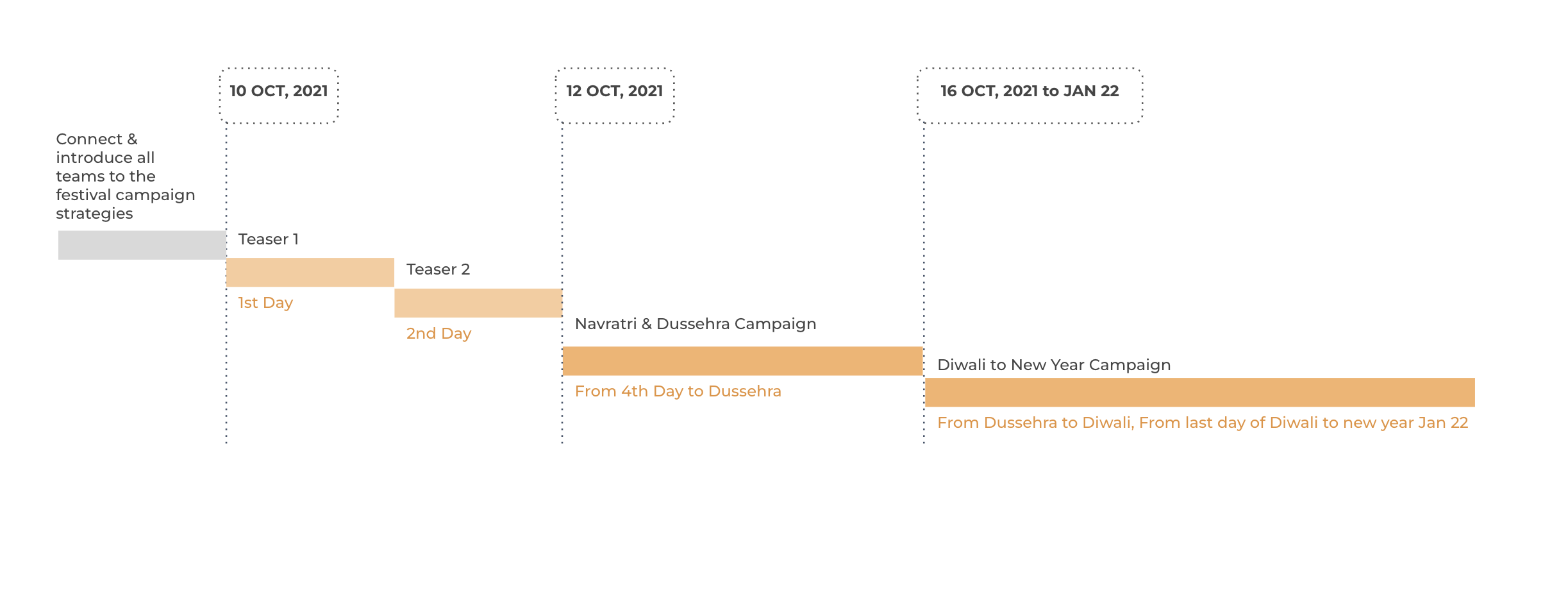
This campaign significantly boosted the company's performance, leading to a remarkable 34% increase in sales for the quarter. Below, we detail the planning and architectural framework of the campaign, showcasing the thoughtful execution behind this successful initiative.
DESIGN BECOME BOLDER AND LOUD
Pushing design limits
At this stage in our company's development, we have carved out a niche as a brand that is both stylish and affordable. Our latest design strategy amplifies our presence with a sense of responsibility and assertiveness. We've taken creative liberties with our initial color palette, expanding our visual identity while staying true to our long-term vision.
This refreshed design concept has resonated well with our audience, garnering substantial admiration. Notably, it has translated into a 57% increase in our social media following and a 23% rise in website traffic, indicating a strong approval and engagement from our users.


